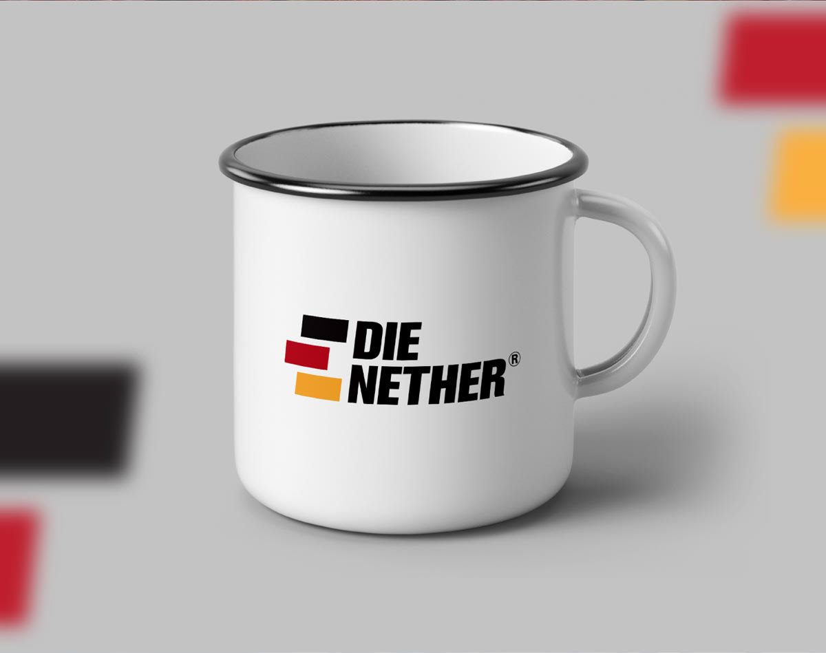
The starting point for the identity was the company's core principles: secure and fast transportation of goods. The security/solidity is achieved by the impactful text, while the fast/dynamic aspects are conveyed by the slight tilt of the logo.
The client also wanted the identity to incorporate, in some way, the German heritage of the family; thus the color selection - which also match the main products of the region: coal, coffee and eucalyptus timber.